Monvue
Brand identity, packaging, and web design for a premium coloured contact lens brand.
Project information
Design Lead. This work was done during my tenure at Lazy Eight.
Monvue is a premium coloured contact lens brand for young, urban Indians who treat self-expression as a daily ritual. The brief was an identity and packaging system worth flaunting, distinctive enough that once you have seen it you do not forget it, in a category that is crowded, price-driven, and largely undesigned.
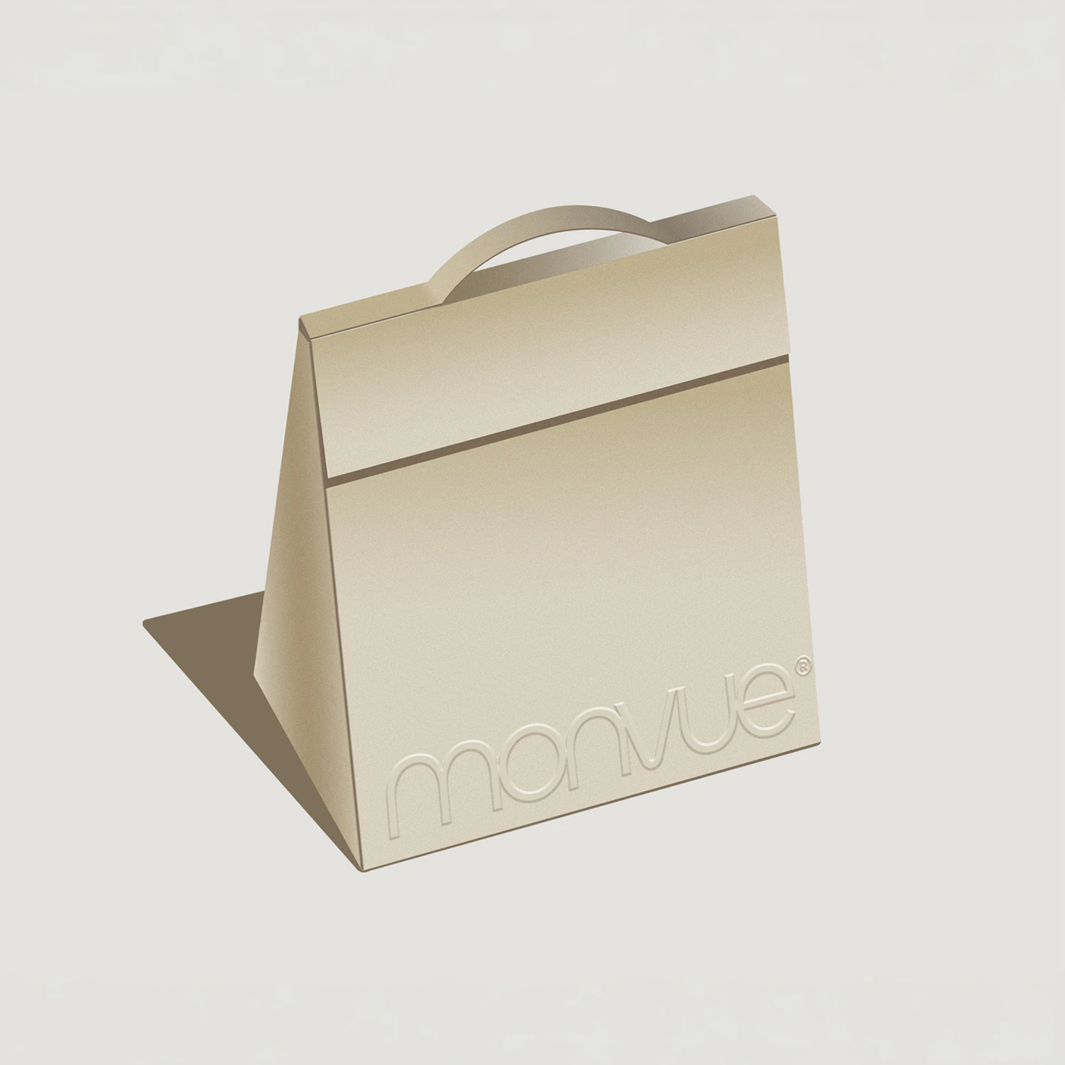
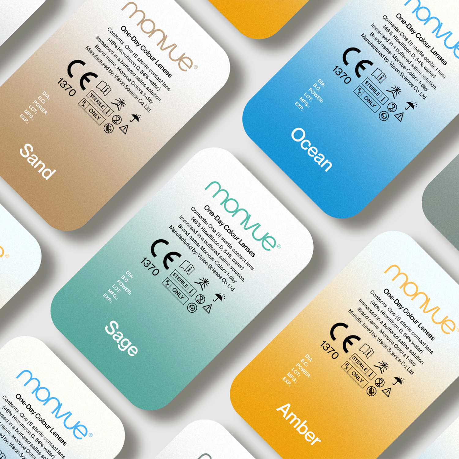
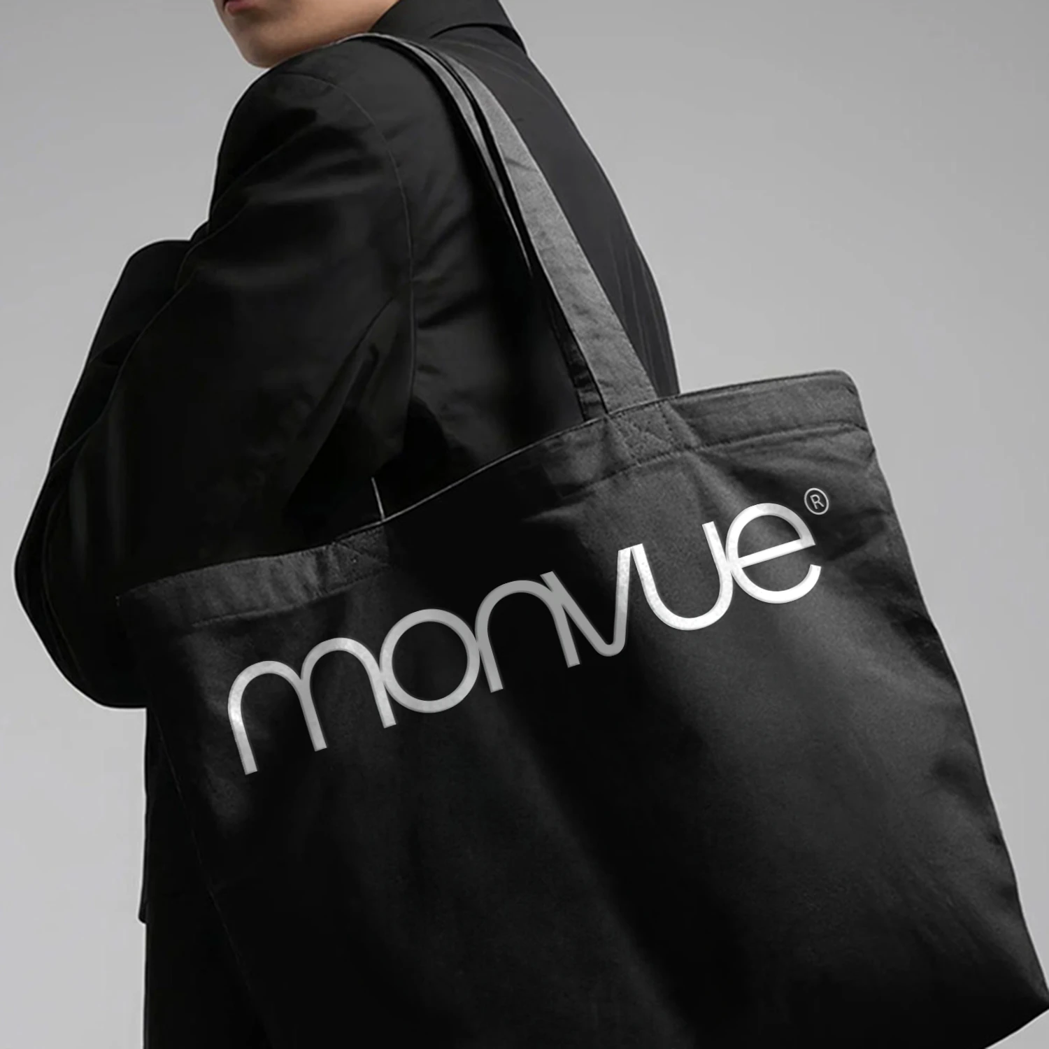
The wordmark came first: clean and confident, with enough character to be remembered. The rounded, fluid letterform sits between premium beauty and modern lifestyle, holding up large on a tote bag and small on a blister pack without leaning on a wider system to do its job.
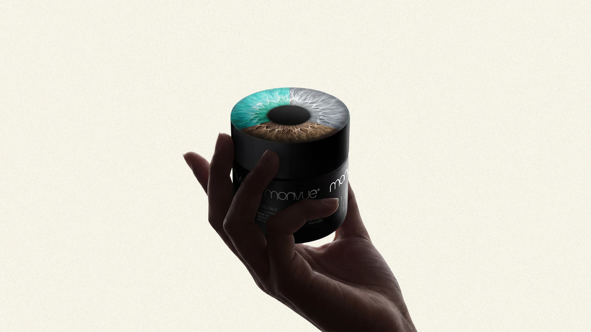
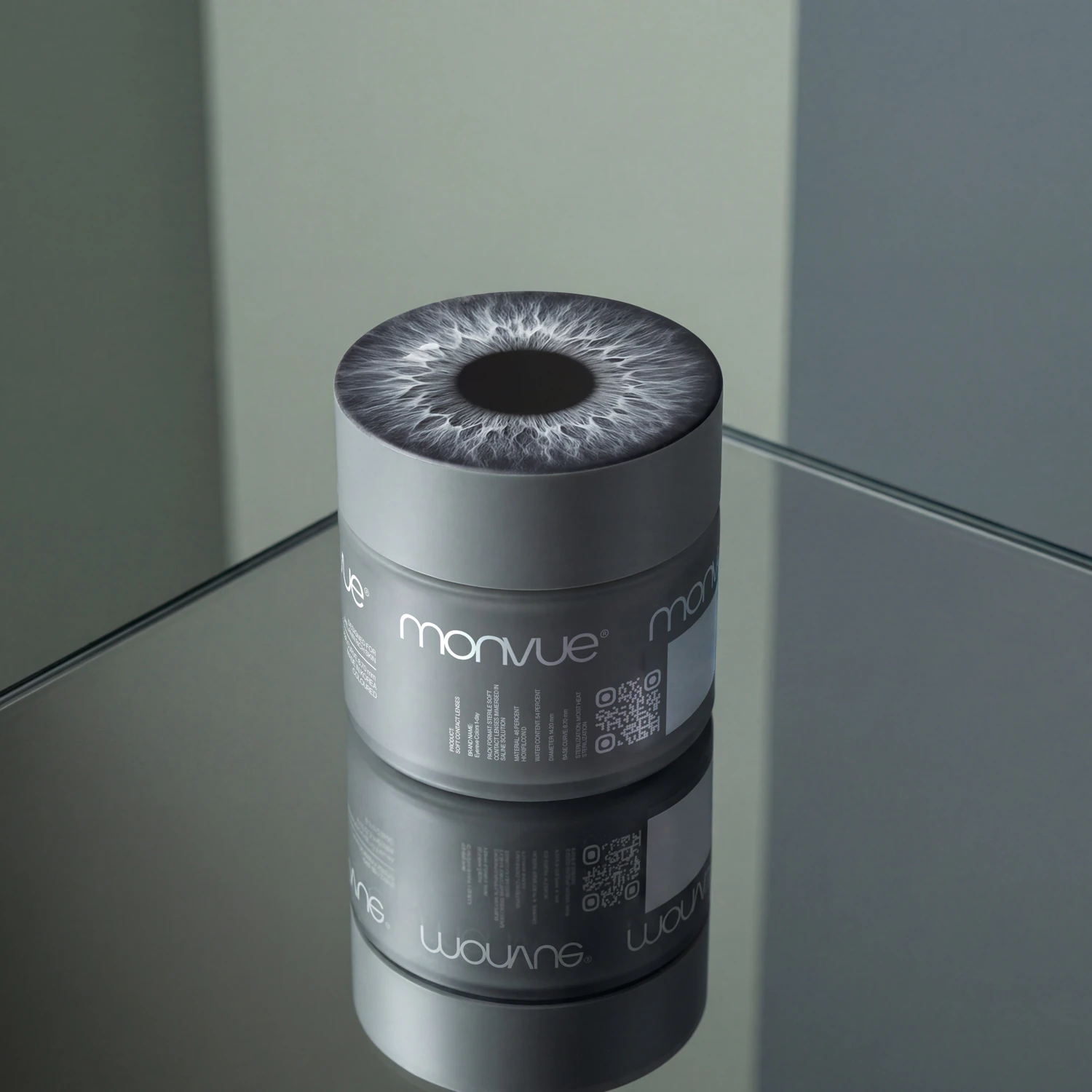
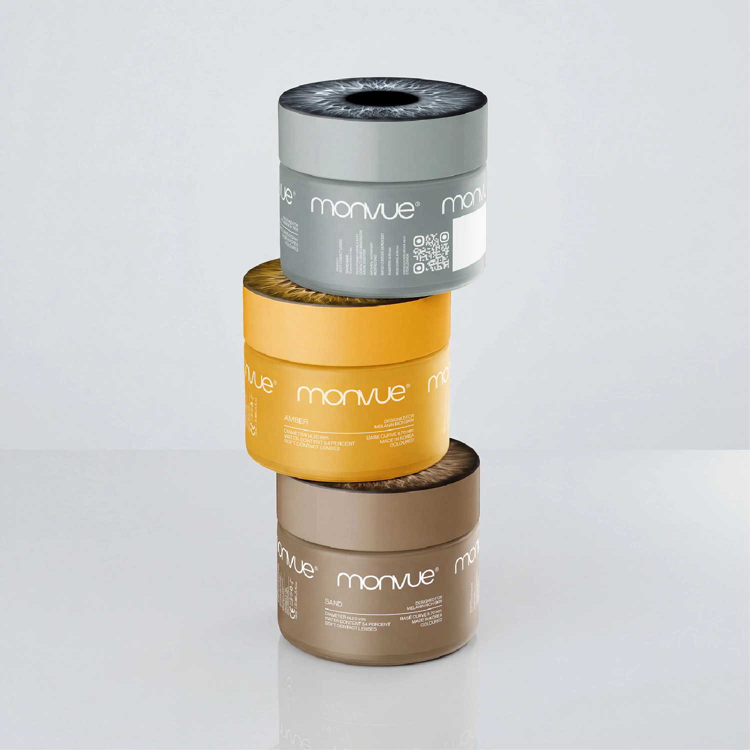
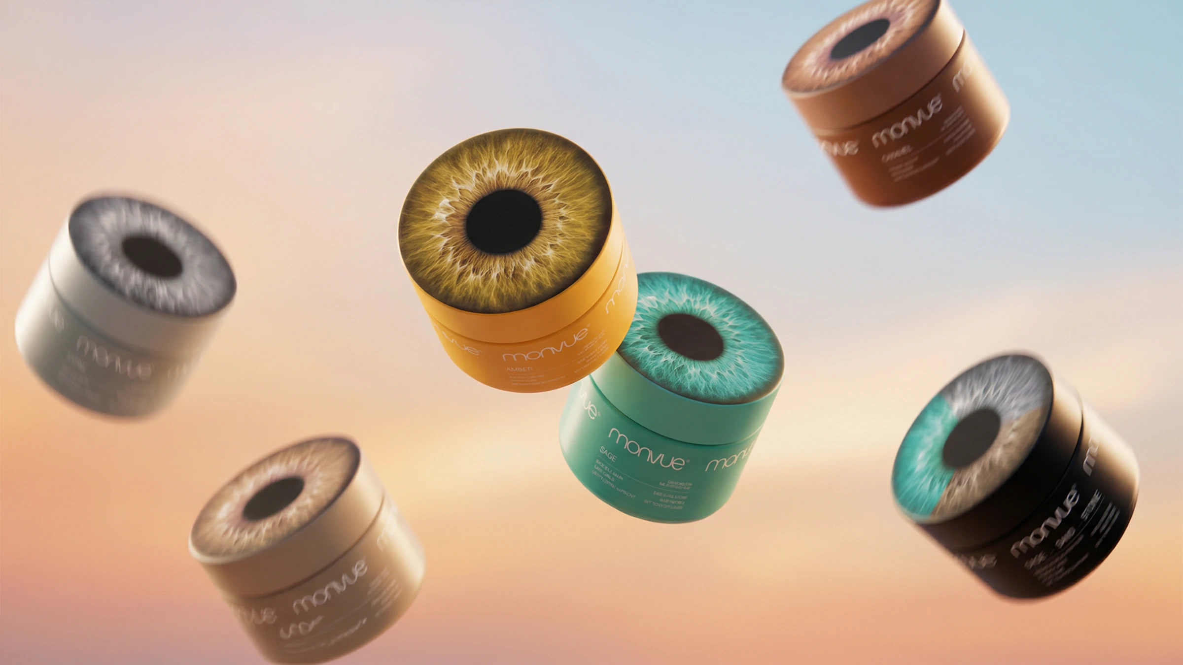
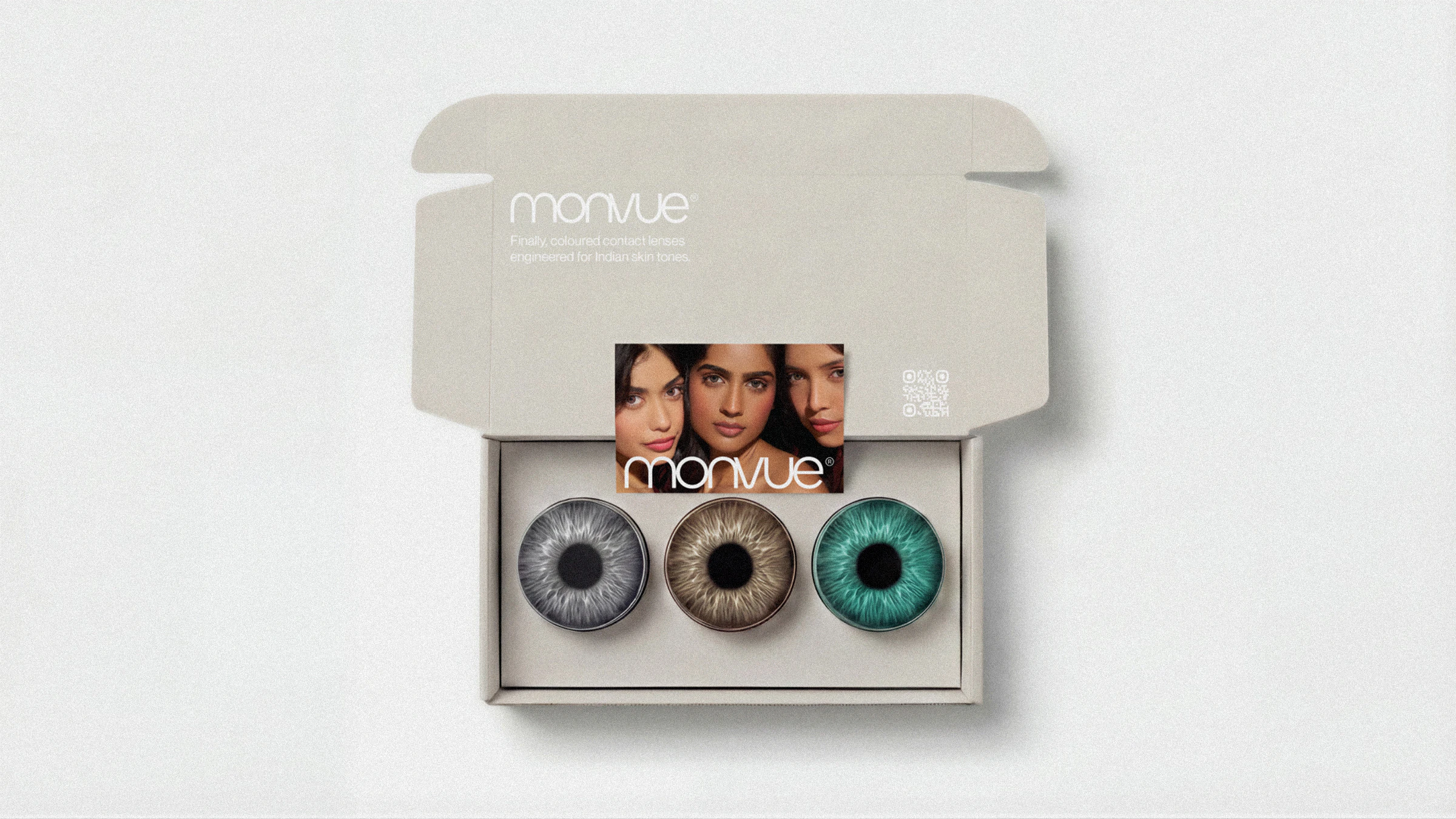
Packaging is where the project had the most to prove: make something that lives on a dresser, not in a drawer. The lid carries a hyper-detailed photograph of a human iris across each cylindrical container, colour-matched to the lens shade inside, so it is arresting and completely logical at once.
Each shade gets its own container colour, so the full range reads as a collection, and the blister labels extend the same gradient thinking at a smaller scale with the wordmark adapting per shade. The outer mailer and carry box stay restrained and tactile.
The Shopify site matches the brand without mimicking it, leading shade selection with skin-tone compatibility rather than colour names, because that is the real question the customer is asking. Across every touchpoint the work holds one position: a brand confident enough to let the product speak for itself.