Indiatimes
Brand identity and rebrand for one of India's largest internet media platforms.
Project information
Art Director. This work was done during my tenure at Animal, New Delhi.
Indiatimes operated at a scale few Indian media brands reach, a portal spanning news, entertainment, and lifestyle, publishing at enormous volume. The reach was never the problem; the register was. Against younger, feed-native publishers it read like a legacy portal in a world that had moved to the phone.
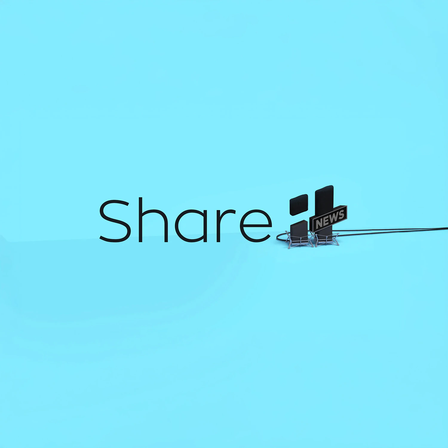
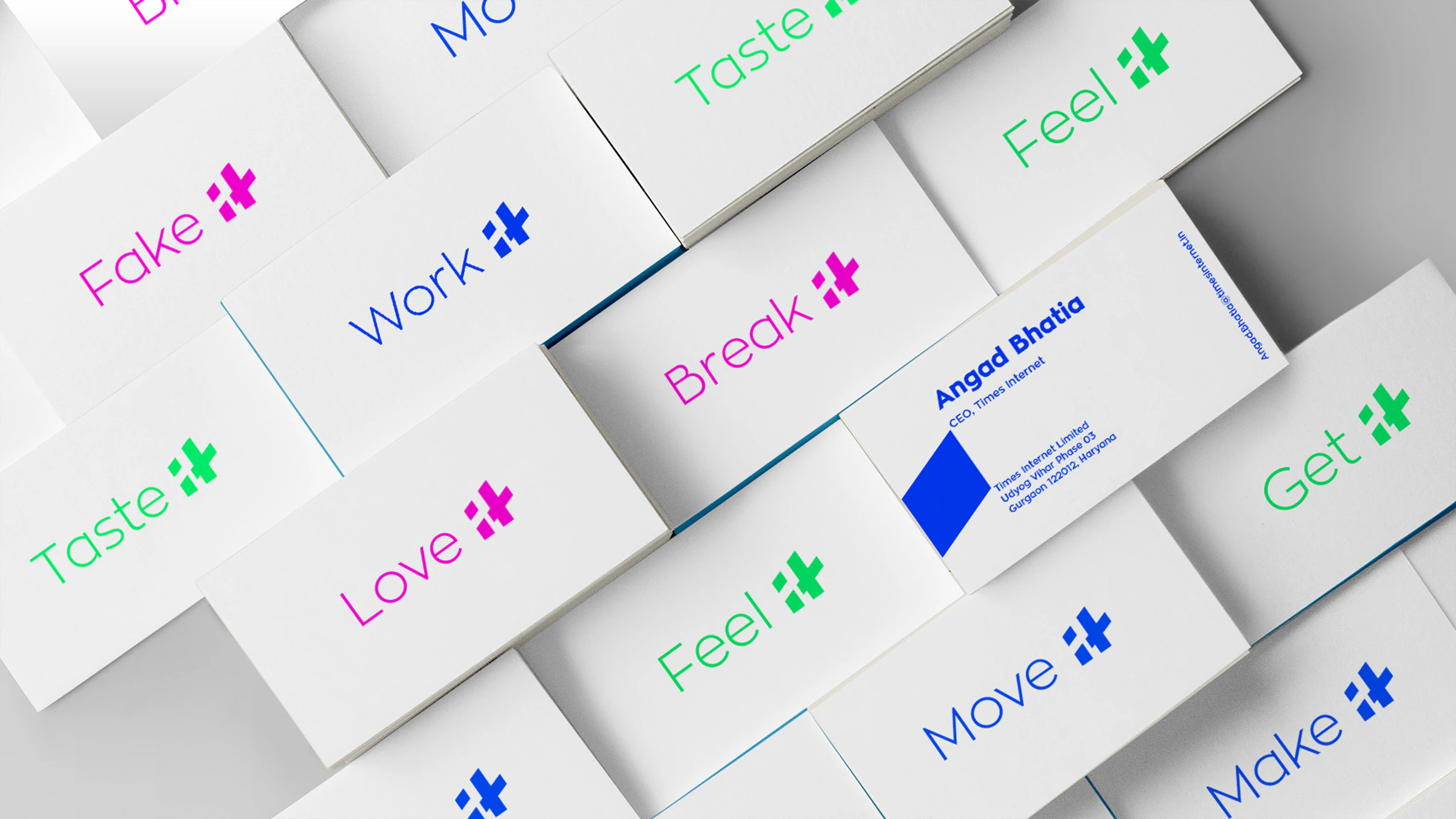
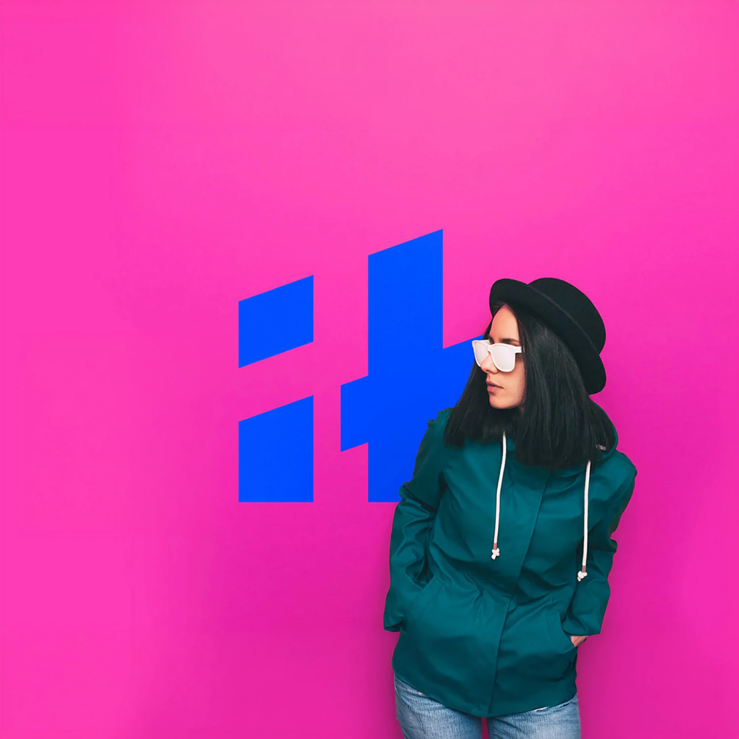
The strategic decision was to compress, not expand. Rather than refresh the existing mark and add to it, we shortened the name to its initials and built the identity around the contraction, IT, something a young audience would actually say, type, and remember.
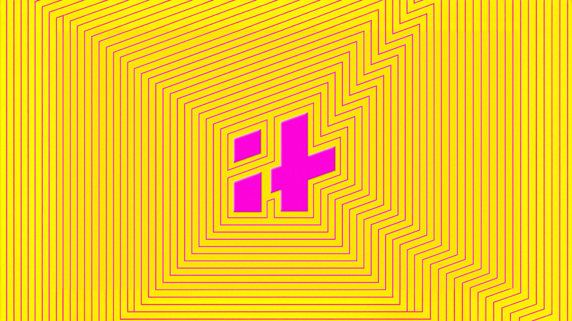
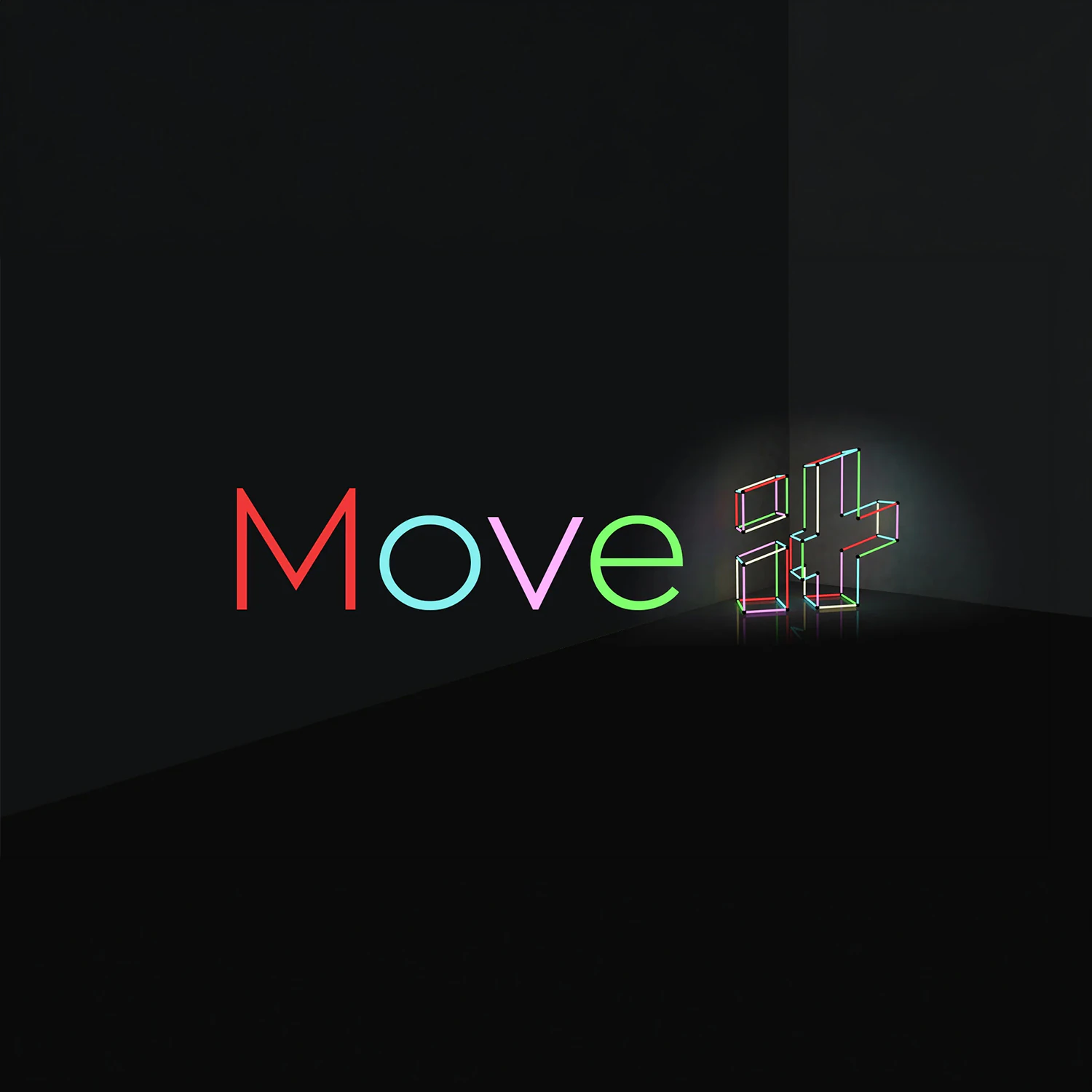
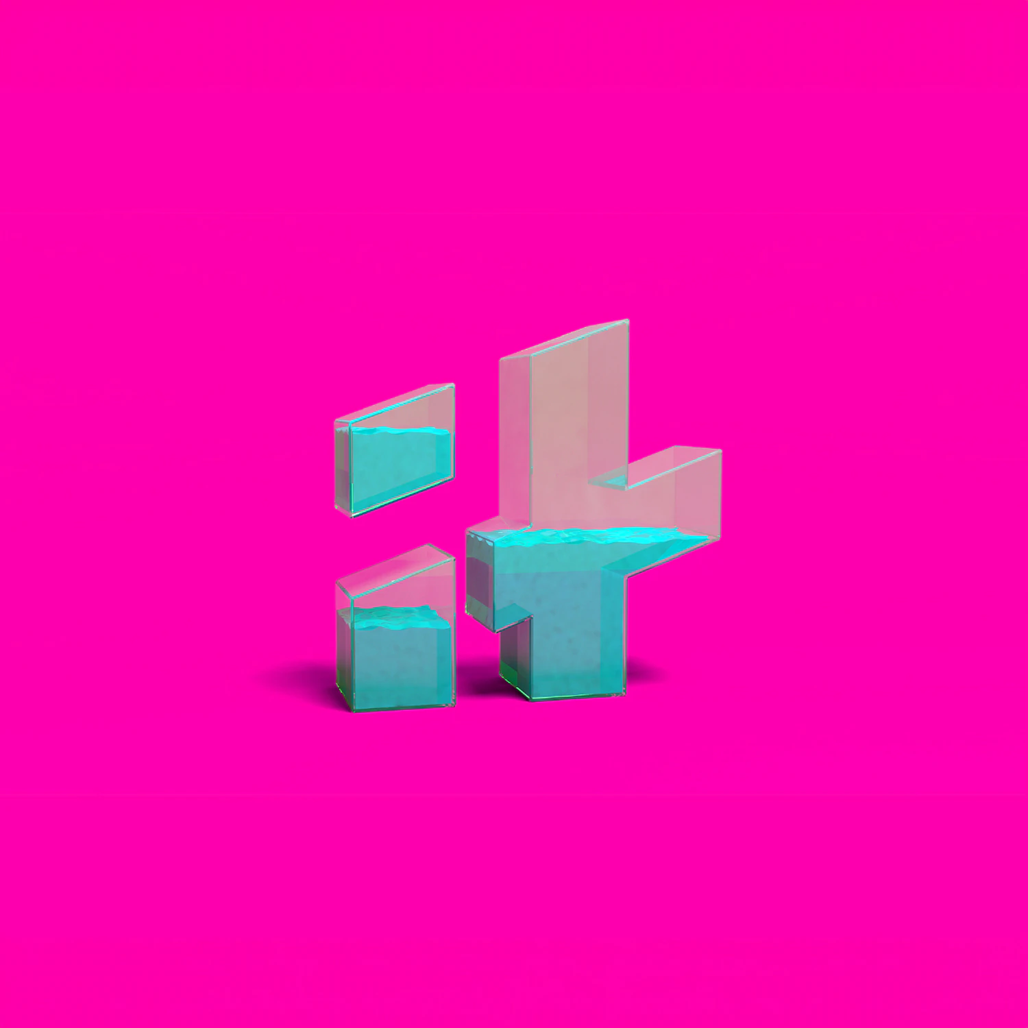
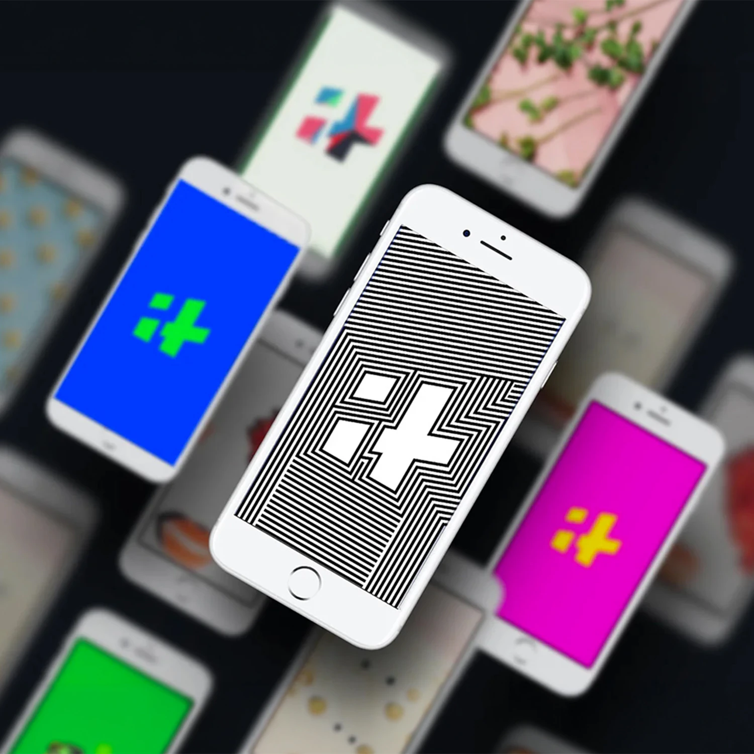
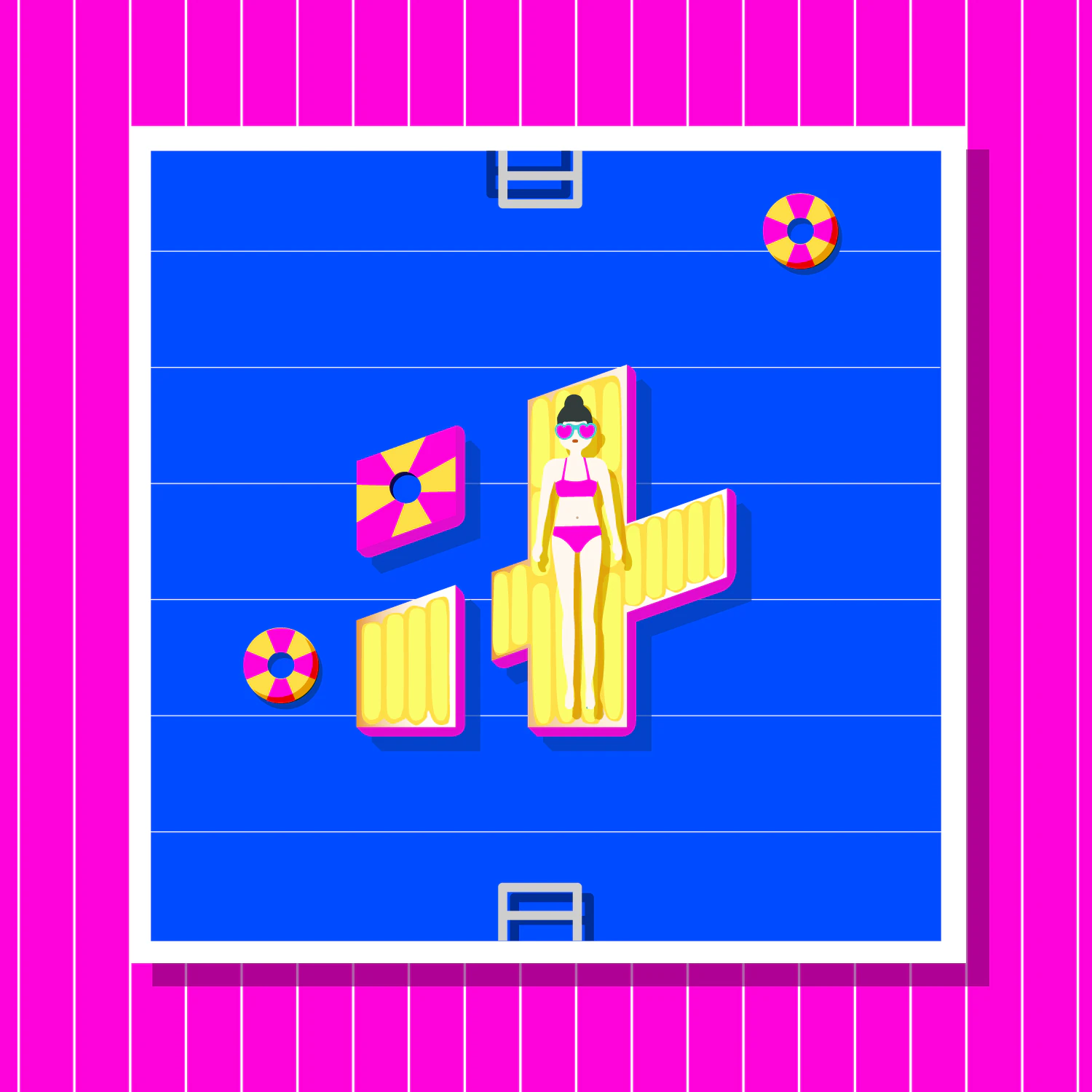
The IT mark is set tight and bold, stripped of decoration. It signals the new register, direct and current, and works as hard at thumbnail size as at full scale, native to a tab, an avatar, an app icon, or a notification.
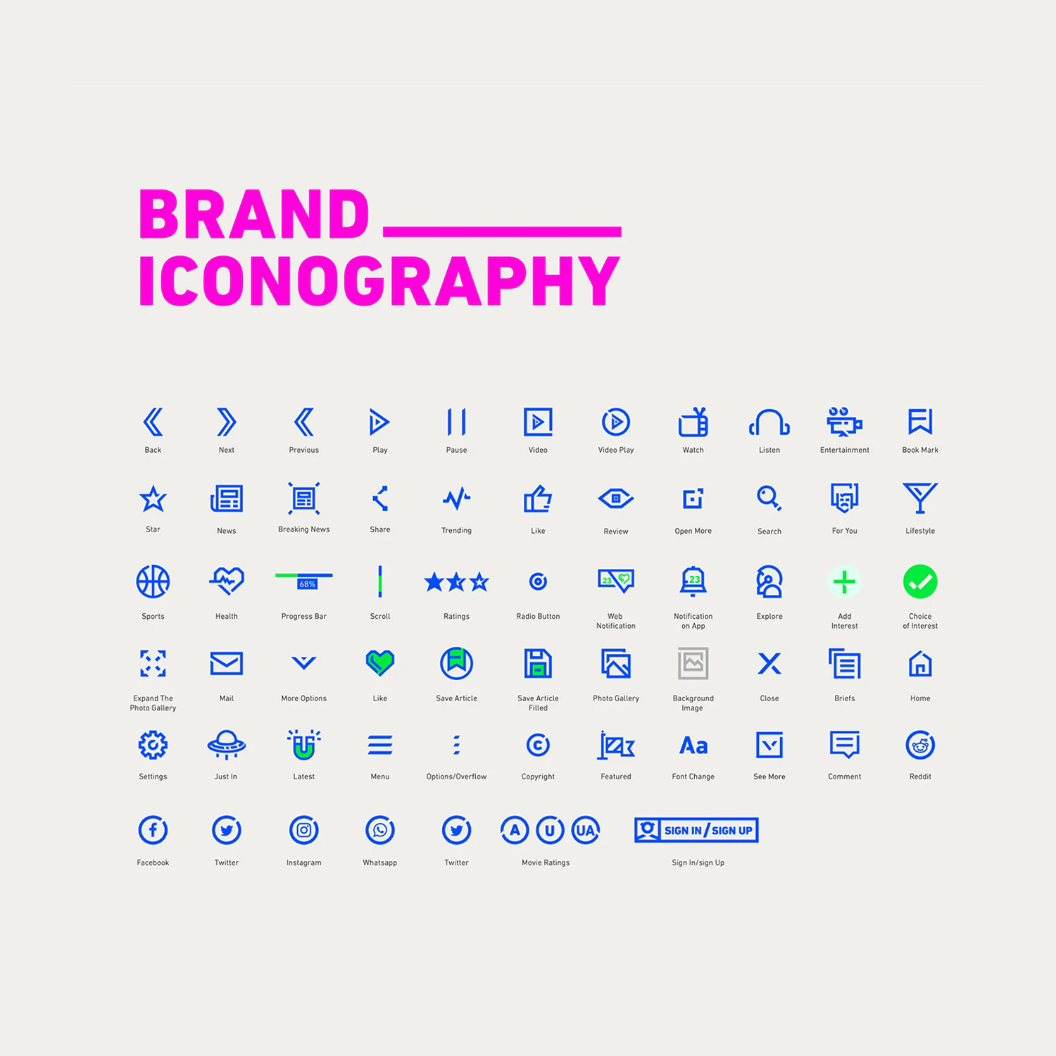
Around the mark, the system was built for speed and contrast: a confident type treatment, a tightened palette, and a flexible icon set that hold together across thousands of pieces of content a day. The identity also extended into the audience's own language with a custom emoji set, the Itmojis.
Across app, promotion, and social, the system behaves one way, less but sharper. Cutting Indiatimes down to IT was a bet that the smallest version of the name was also the most current one.